Brand identity for the Matterhorn Eagle Cup, an alpine golf tournament in Zermatt
Branding for Golfclub Matterhorn: a heritage crest for the Matterhorn Eagle Cup in Zermatt, Europe’s first high-altitude golf tournament, founded in 1992.
Golfclub Matterhorn
Role
- Corporate Identity
Context
The Matterhorn Eagle Cup has been played above Zermatt since 1992, at around 3,000 metres. Simon Biner and Harry Lauber brought the idea back from a tournament abroad and turned it into Europe’s first high-altitude golf event. In 2018, Golfclub Matterhorn asked me for a new brand identity. I knew the tournament from the inside, having photographed it for several summers.
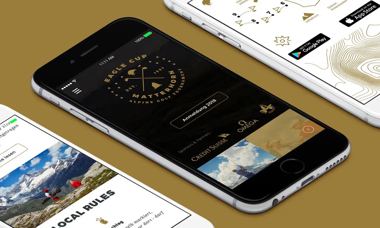
After more than twenty-five years, the event had outgrown its first logo. It had become a reference, with partners like Omega and Credit Suisse, and deserved an image to match.
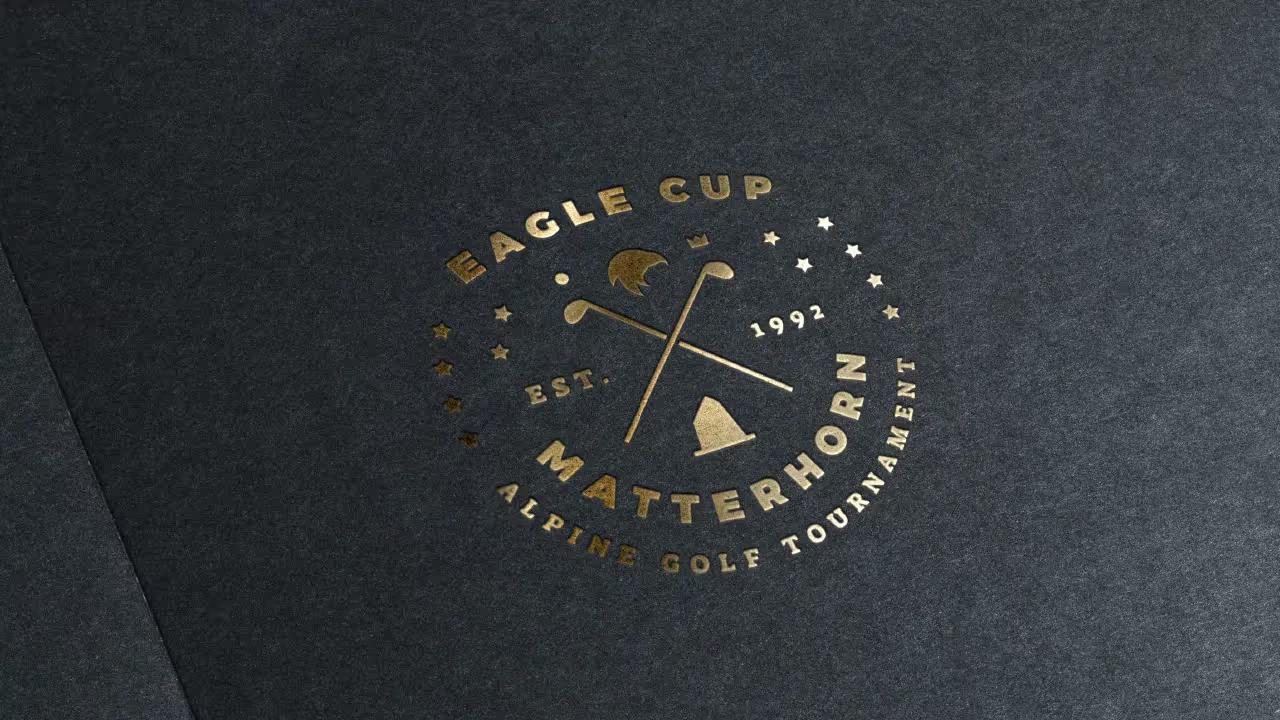
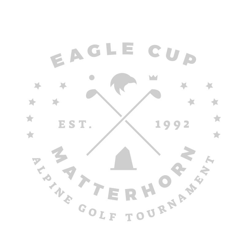
The new mark is a round crest, built like a club badge. Two vintage clubs cross to form an X. Above them, an eagle’s head: the bird in the name, and the golf score of two under par. Below, the flat-topped silhouette of the Matterhorn anchors the tournament in Zermatt. EST. 1992 on either side, a small crown, fourteen stars closing the circle. EAGLE CUP runs along the top arc, MATTERHORN and ALPINE GOLF TOURNAMENT along the bottom.
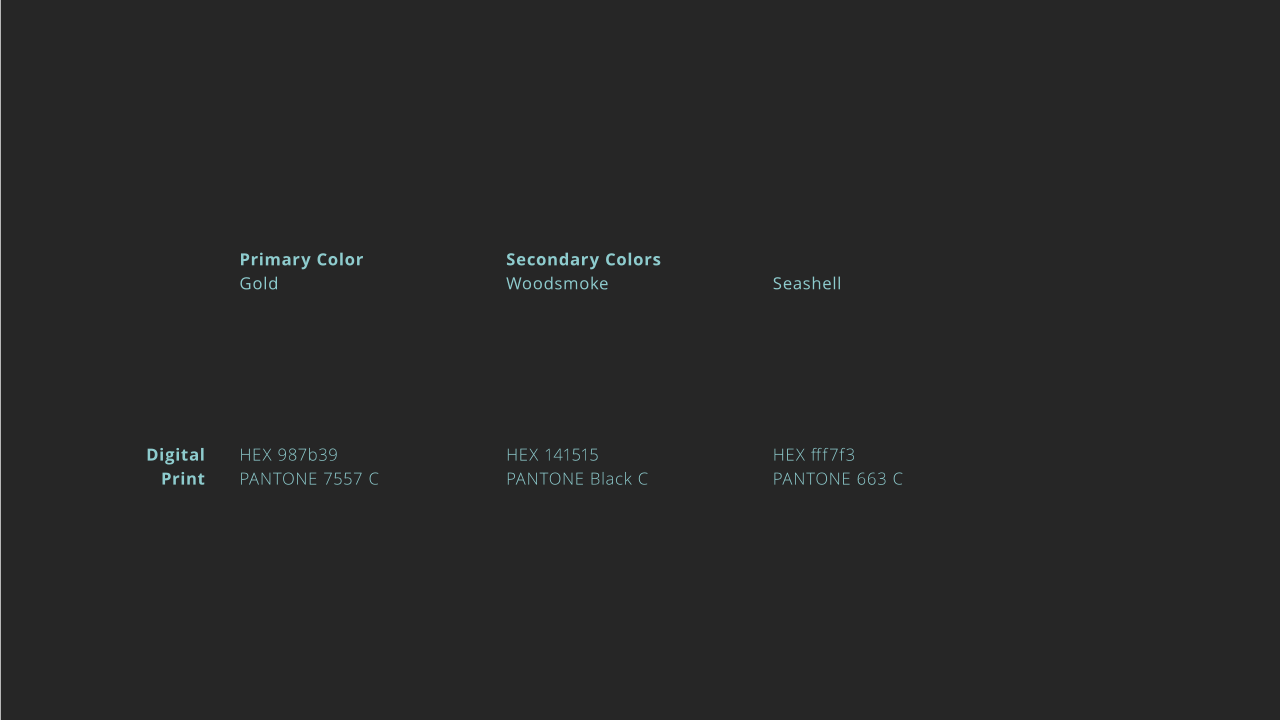
One gold, Woodsmoke for depth, Seashell for air. Gold foil on dark card for the invitations, then signage on site and merch for the players.
The club was very pleased with the new look. Above all, it gave the tournament a clearer vision to present to new sponsors, with more assurance. At 3,000 metres, a logo stands next to the Matterhorn. It had better hold its own.

They trusted me (Still do)
