Brand identity for MAISONNOÉE, a Berlin prêt-à-porter fashion label
Branding for MAISONNOÉE, the Berlin prêt-à-porter label founded by designer Sophie Oemus: a slender, tall monogram built from an M and a reversed N.
Role
- Corporate Identity
Credits
Photoshoots © MAISONNOÉE
Context
MAISONNOÉE is a high-end prêt-à-porter label founded in Berlin in 2013 by designer Sophie Oemus, née Böhmert, an ESMOD Berlin graduate. Clear cuts, feminine and timeless elegance, carefully chosen materials and leather worked with new techniques. Designed in Berlin, made in Europe. From the very start, while I was still living in Berlin, SCHMITZ&WIESNER asked me to build its brand identity from scratch.
The name is a neologism. A house of peace, strength and calm, in the image of the women who wear MAISONNOÉE: accomplished, intelligent, cultured. No showmanship, no false modesty either. The logo had to hold the same line.
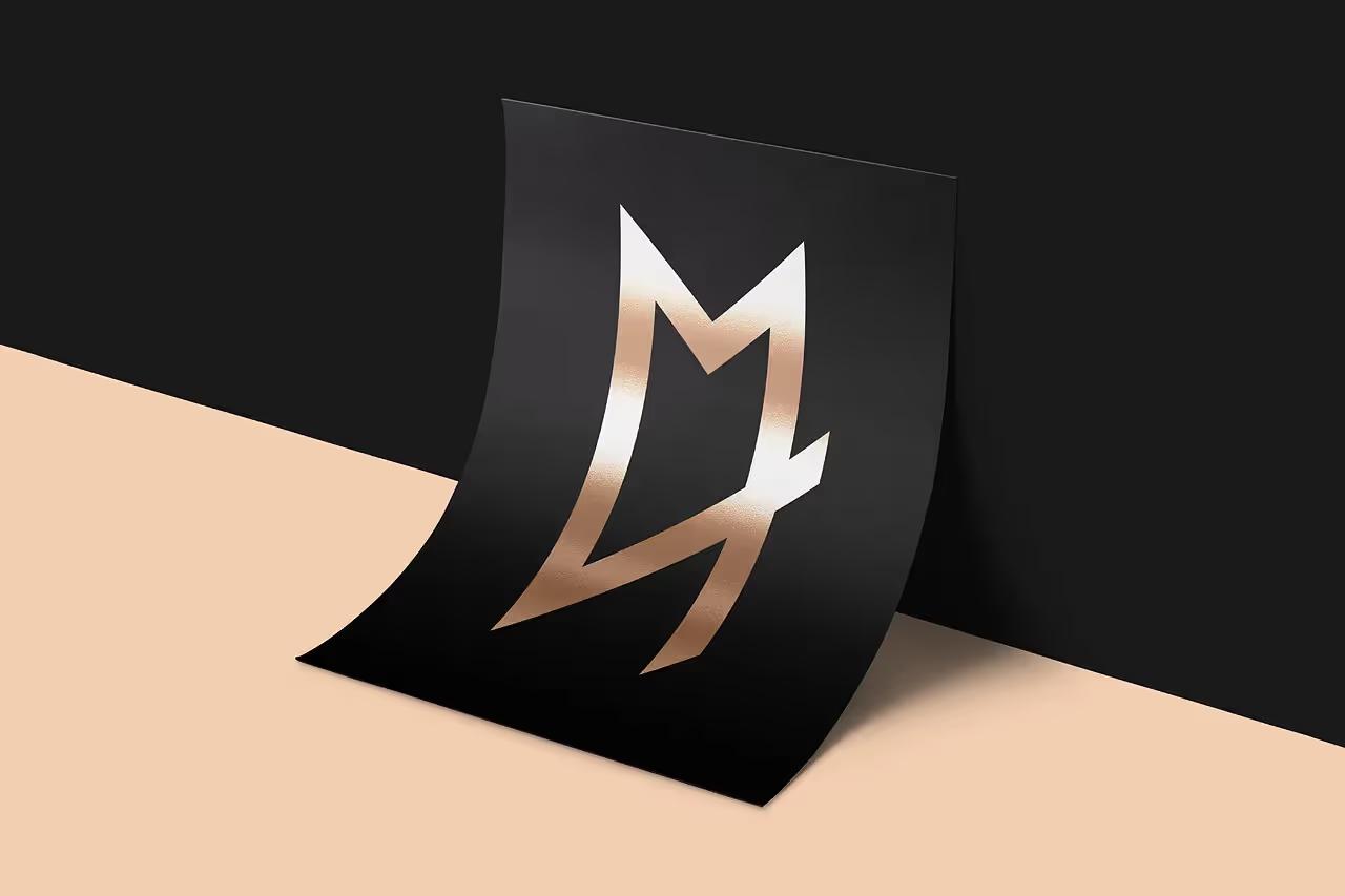
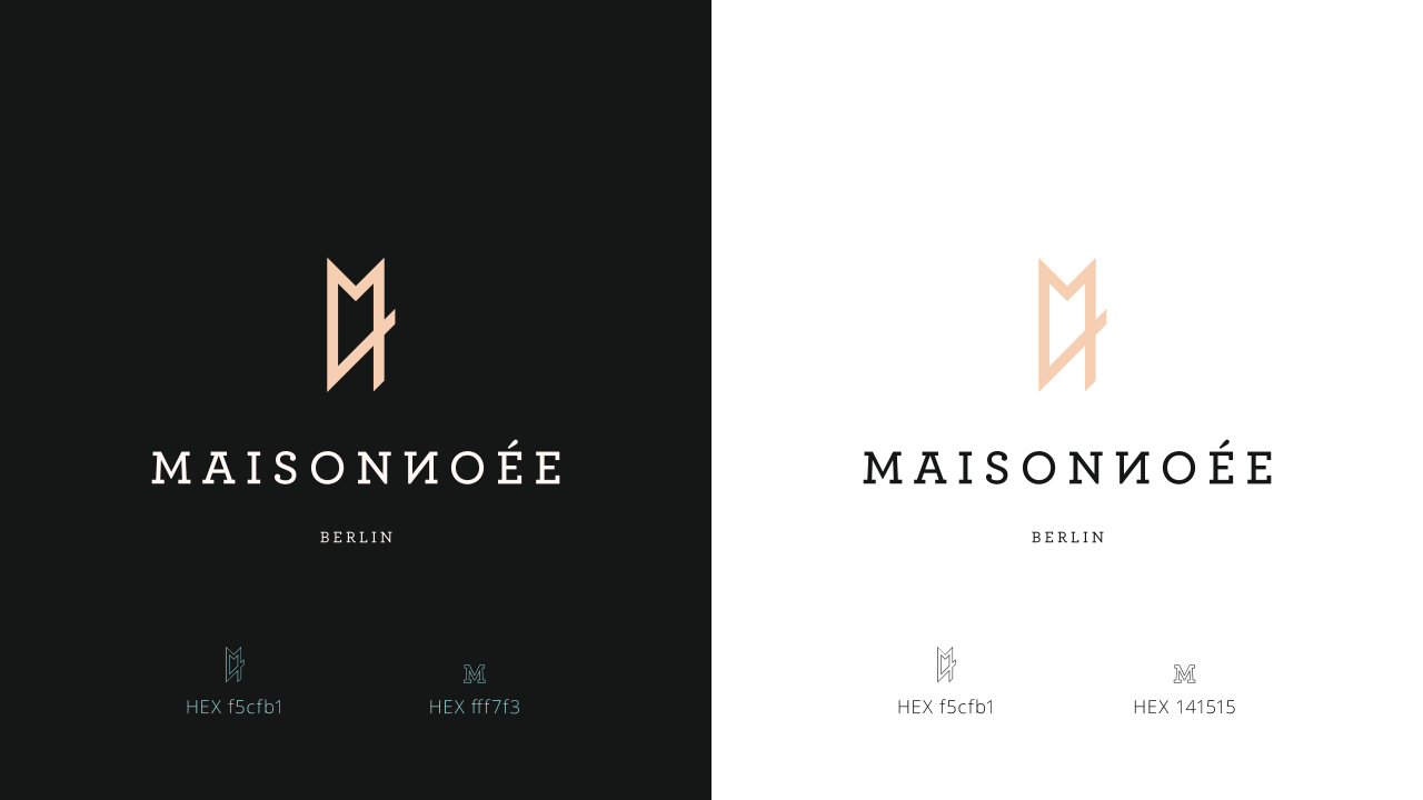
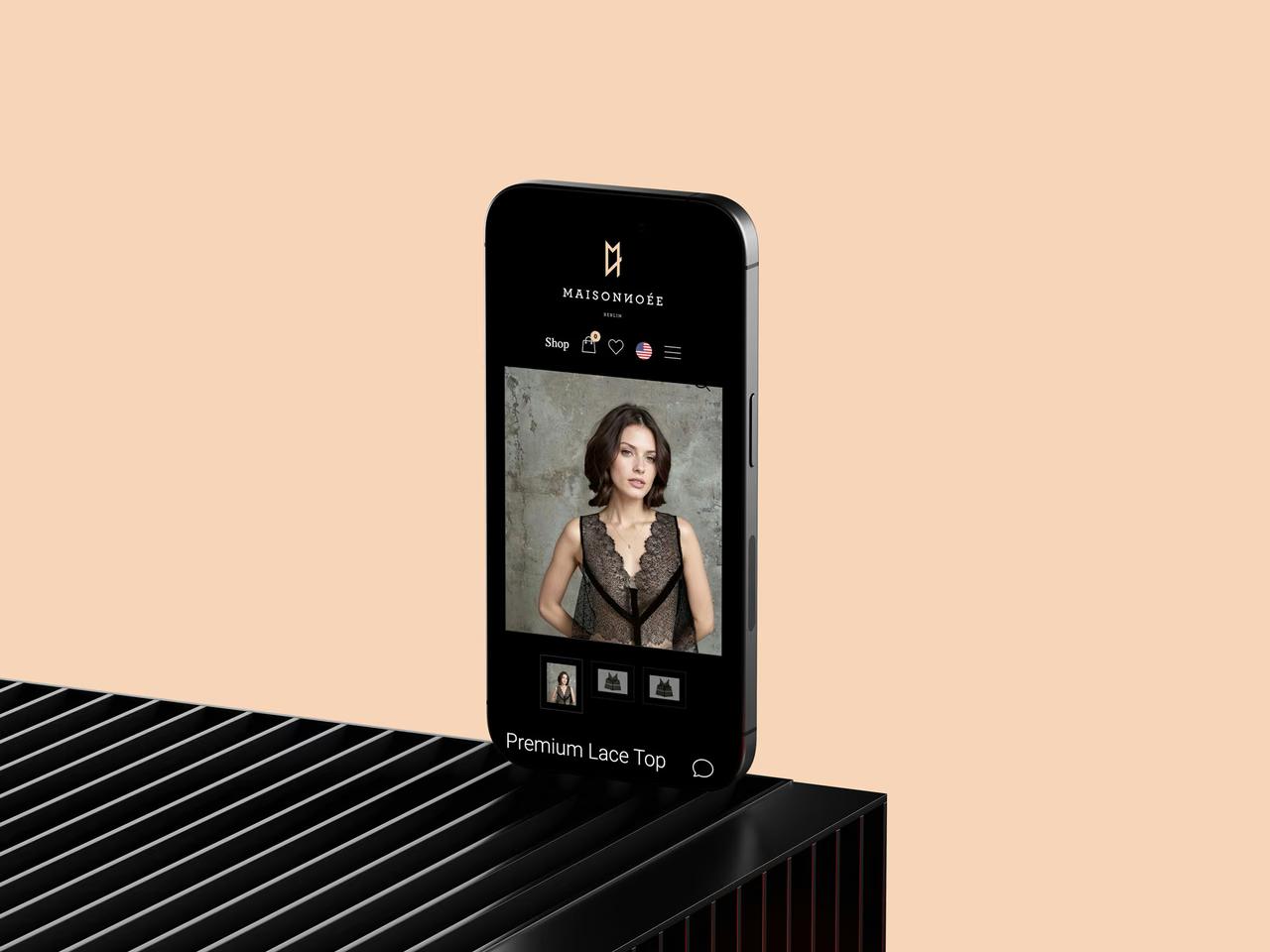
In the logotype, the second N of MAISONNOÉE is reversed. The mark picks up that same detail: an M and a reversed N, fused into a single form. The construction is purely geometric, with squares of equal side, a slanted parallelogram and straight cuts. The M stays thin and stretched in height, like the silhouette of a model on the runway.
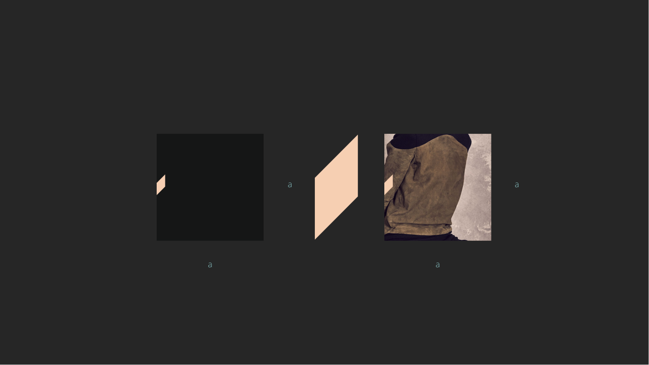
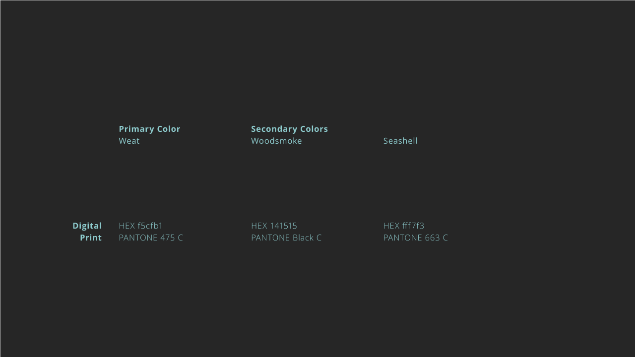
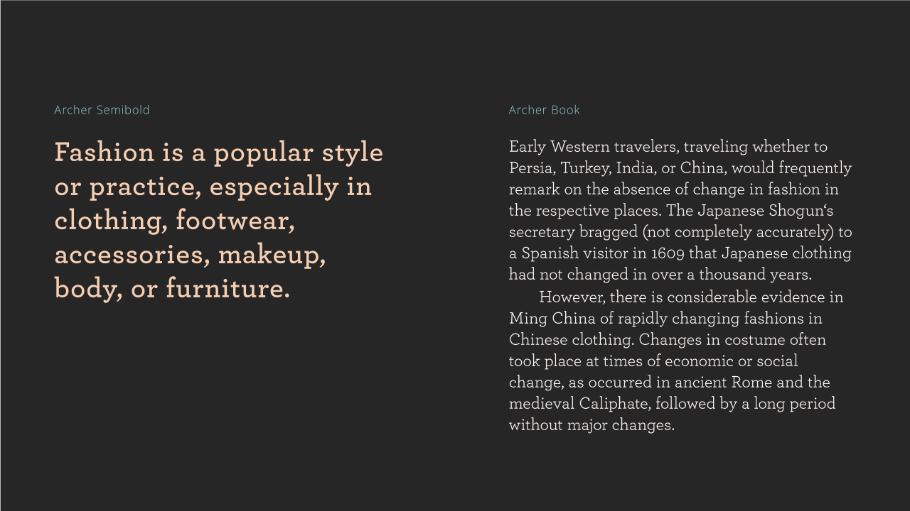
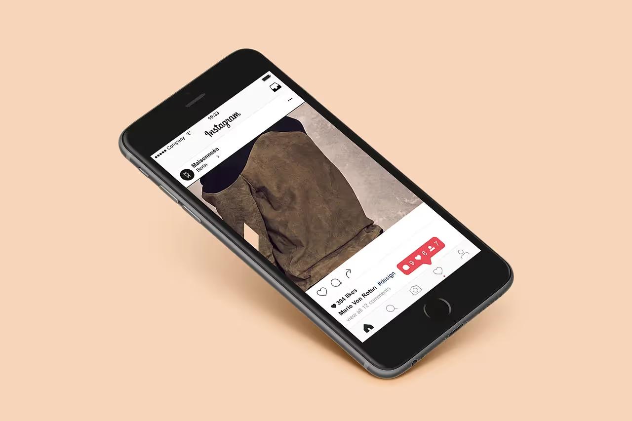
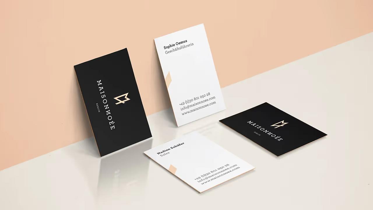
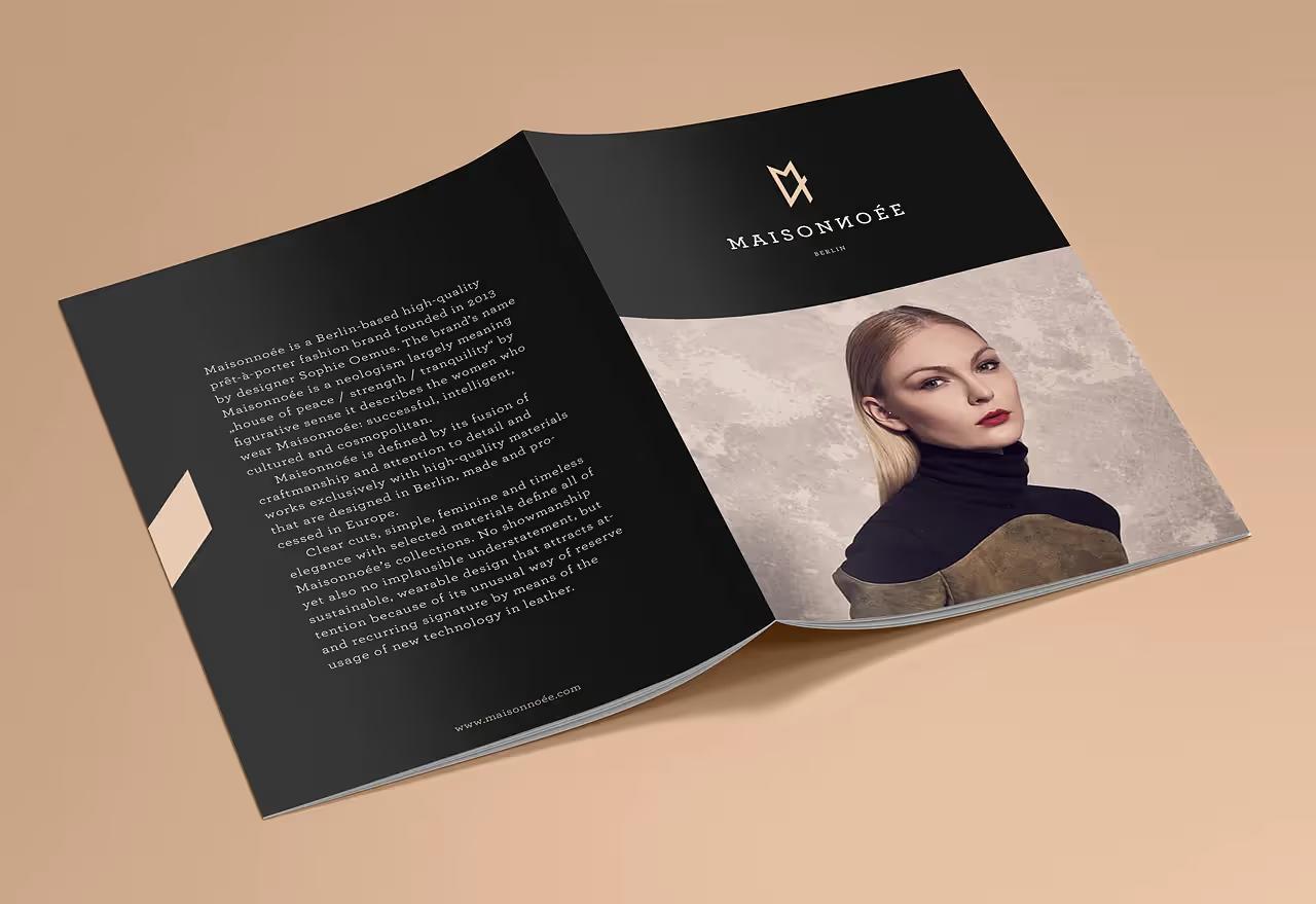
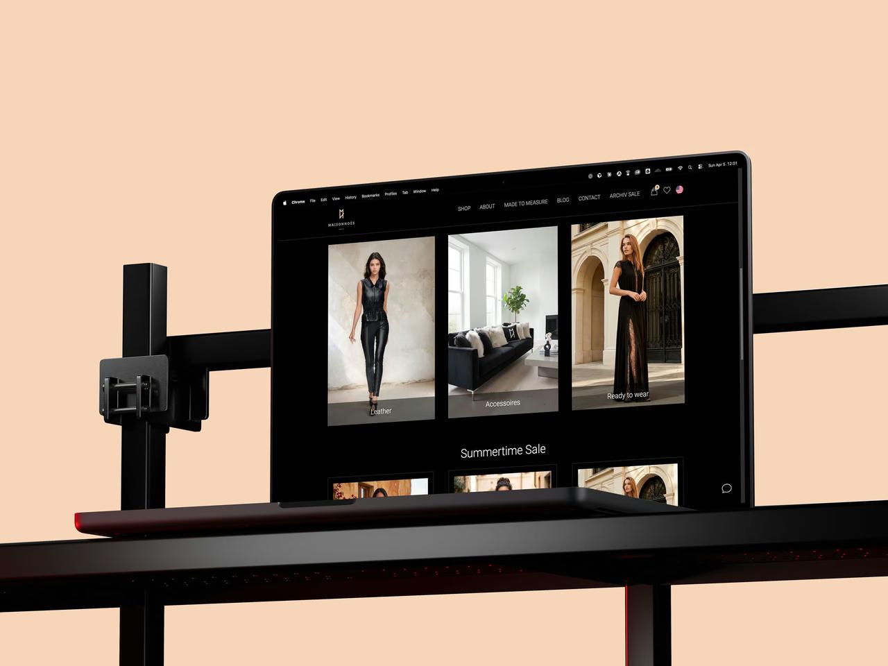
The parallelogram also lives on its own, as a graphic accent across every touchpoint. Archer for type, Semibold for headlines and Book for text. Wheat, a warm nude, as the signature colour, set against Woodsmoke black and Seashell white. Copper foil on black card, business cards, a brochure, the social feeds.
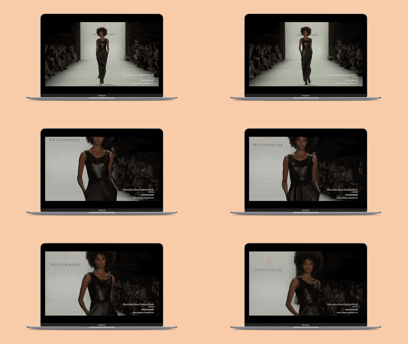
The client was so pleased they took the logo everywhere: on the clothes, on merch, on the runway stage, all the way to Mercedes-Benz Fashion Week Berlin. Thirteen years later, it still signs the 2026 collections. In fashion, a season lasts six months. A logo that outlives twenty-six of them has done its job.

They trusted me (Still do)
